In addition to CpG sites, there are 4 sets of genomic regions to be covered in the analysis. The table below gives a summary of these annotations.
| tiling |
Genome tiling regions of length 5000 |
165008 |
| genes |
Ensembl genes, version Ensembl Genes 67 |
21277 |
| promoters |
Promoter regions of Ensembl genes, version Ensembl Genes 67 |
19021 |
| cpgislands |
CpG island track of the UCSC Genome browser |
14293 |
Region length distributions
The plots below show region size distributions for the region types above.
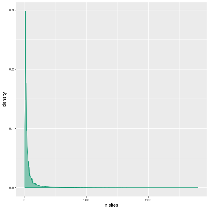
Number of sites per region
The plots below show the distributions of the number of sites per region type.
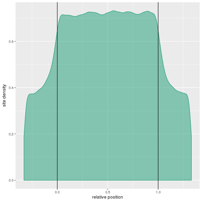
Region site distributions
The plots below show distributions of sites across the different region types.
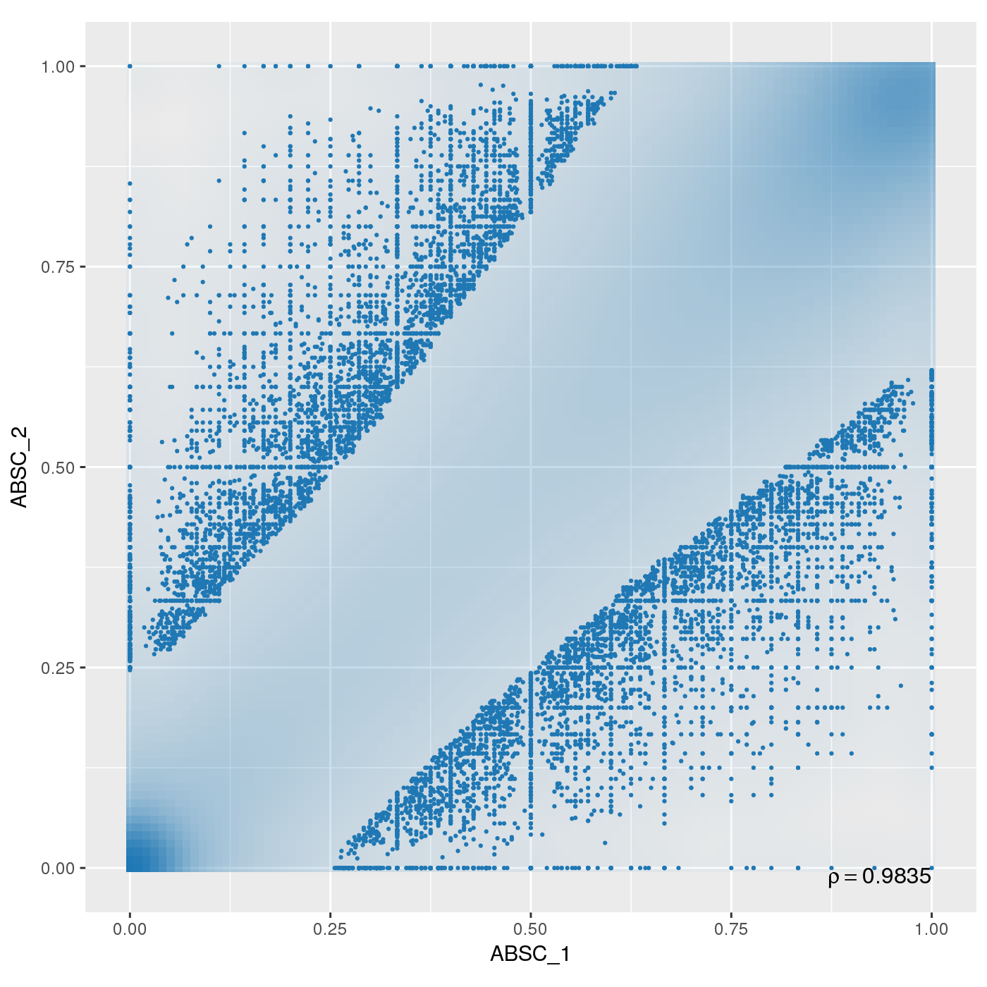
Sample replicates were compared. This section shows pairwise scatterplots for each sample replicate group on both site and region level.
The following table contains pearson correlation coefficients:
| 0.9835 |
0.9758 |
0.9911 |
0.9914 |
0.994 |
| 0.9875 |
0.9772 |
0.9922 |
0.9928 |
0.9953 |
| 0.9867 |
0.9726 |
0.989 |
0.9915 |
0.9946 |
| 0.9886 |
0.9787 |
0.9933 |
0.9937 |
0.9957 |
| 0.9746 |
0.9628 |
0.987 |
0.9867 |
0.9912 |
| 0.9865 |
0.9764 |
0.9925 |
0.9928 |
0.9942 |
| 0.9816 |
0.9727 |
0.9911 |
0.9906 |
0.9934 |
| 0.9794 |
0.97 |
0.9904 |
0.9894 |
0.9914 |
| 0.9459 |
0.8855 |
0.9543 |
0.9674 |
0.9833 |
| 0.9849 |
0.9681 |
0.9886 |
0.99 |
0.9944 |
| 0.9883 |
0.9758 |
0.9905 |
0.9921 |
0.9956 |
| 0.9802 |
0.9611 |
0.9845 |
0.9866 |
0.9897 |
| 0.9644 |
0.9418 |
0.9784 |
0.9792 |
0.9866 |
| 0.9834 |
0.9653 |
0.9899 |
0.9912 |
0.9959 |
| 0.9743 |
0.9532 |
0.9806 |
0.9834 |
0.9892 |
| 0.991 |
0.9837 |
0.9947 |
0.9951 |
0.9969 |
| 0.99 |
0.9809 |
0.9928 |
0.9938 |
0.9967 |
| 0.9887 |
0.9786 |
0.9927 |
0.9929 |
0.996 |
| 0.9771 |
0.9616 |
0.9848 |
0.9852 |
0.9919 |
Dimension reduction is used to visually inspect the dataset for a strong signal in the methylation values that is related to samples' clinical or batch processing annotation. RnBeads implements two methods for dimension reduction - principal component analysis (PCA) and multidimensional scaling (MDS).
One or more of the methylation matrices was augmented before applying the dimension reduction techniques because it contains missing values. The column Missing lists the number of dimensions ignored due to missing values. In the case of MDS, dimensions are ignored only if they contain missing values for all samples. In contrast, sites or regions with missing values in any sample are ignored prior to PCA.
| sites |
MDS |
1353082 |
0 |
1353082 |
| sites |
PCA |
1353082 |
663891 |
689191 |
| tiling |
MDS |
165008 |
0 |
165008 |
| tiling |
PCA |
165008 |
38179 |
126829 |
| genes |
MDS |
21277 |
0 |
21277 |
| genes |
PCA |
21277 |
1387 |
19890 |
| promoters |
MDS |
19021 |
0 |
19021 |
| promoters |
PCA |
19021 |
1860 |
17161 |
| cpgislands |
MDS |
14293 |
0 |
14293 |
| cpgislands |
PCA |
14293 |
665 |
13628 |
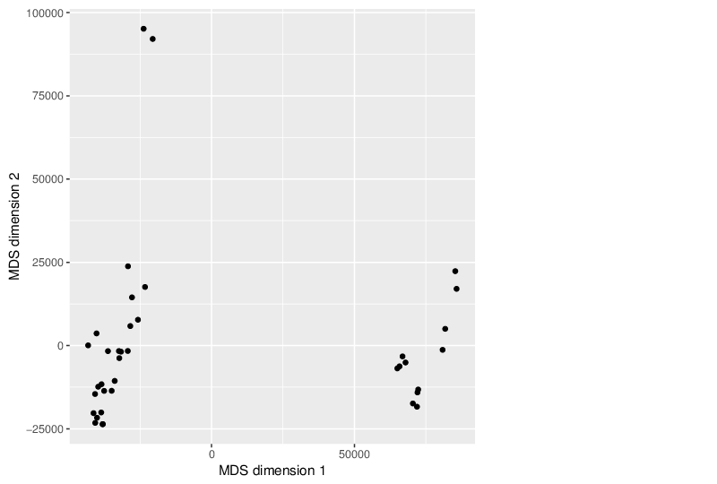
Multidimensional Scaling
The scatter plot below visualizes the samples transformed into a two-dimensional space using MDS.
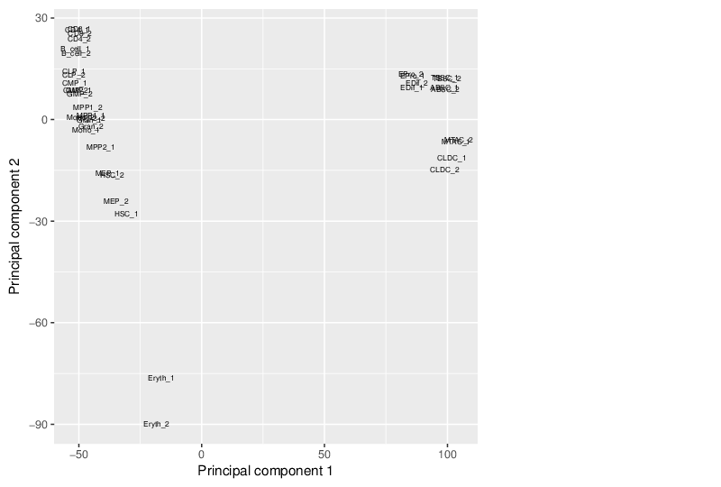
Principal Component Analysis
Similarly, the figure below shows the values of selected principal components in a scatter plot.
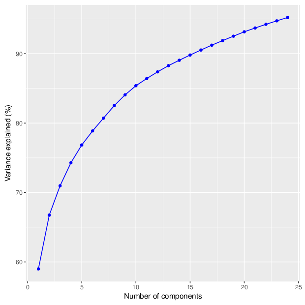
The figure below shows the cumulative distribution functions of variance explained by the principal components.
The table below gives for each location type a number of principal components that explain at least 95 percent of the total variance. The full tables of variances explained by all components are available in comma-separated values files accompanying this report.
In this section, different properties of the dataset are tested for significant associations. The properties can include sample coordinates in the principal component space, phenotype traits and intensities of control probes. The tests used to calculate a p-value given two properties depend on the essence of the data:
- If both properties contain categorical data (e.g. tissue type and sample processing date), the test of choice is a two-sided Fisher's exact test.
- If both properties contain numerical data (e.g. coordinates in the first principal component and age of individual), the correlation coefficient between the traits is computed. A p-value is estimated using permutation tests with 10000 permutations.
- If property A is categorical and property B contains numeric data, p-value for association is calculated by comparing the values of B for the different categories in A. The test of choice is a two-sided Wilcoxon rank sum test (when A defines two categories) or a Kruskal-Wallis one-way analysis of variance (when A separates the samples into three or more categories).
Note that the p-values presented in this report are not corrected for multiple testing.
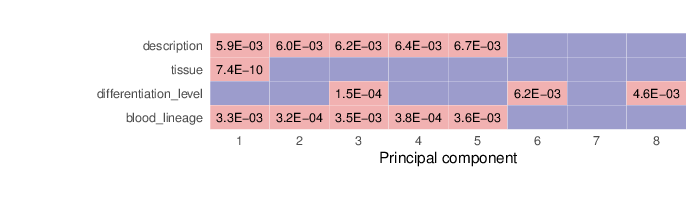
Associations between Principal Components and Traits
The computed sample coordinates in the principal component space were tested for association with the specified traits. Below is a list of the traits and the tests performed.
| description |
Kruskal-Wallis |
| tissue |
Wilcoxon |
| differentiation_level |
Kruskal-Wallis |
| blood_lineage |
Kruskal-Wallis |
The heatmap below summarizes the results of permutation tests performed for associations. Significant p-values (values less than 0.01) are displayed in pink background.
The full tables of p-values for each location type are available in CSV (comma-separated value) files below.
Associations between Traits
This section summarizes the associations between pairs of traits.
The figure below visualizes the tests that were performed on trait pairs based on the description provided above. In some cases, pairs of traits could not be tested for associations. These scenarios are marked by grey shapes, and the underlying reason is given in the figure legend. In addition, the calculated p-values for associations between traits are shown. Significant p-values (values less than 0.01) are displayed in pink background. The full table of p-values is available in a dedicated file that accompanies this report.
Methylation value distributions were assessed based on selected sample groups. This was done on site and region levels. This section contains the generated density plots.
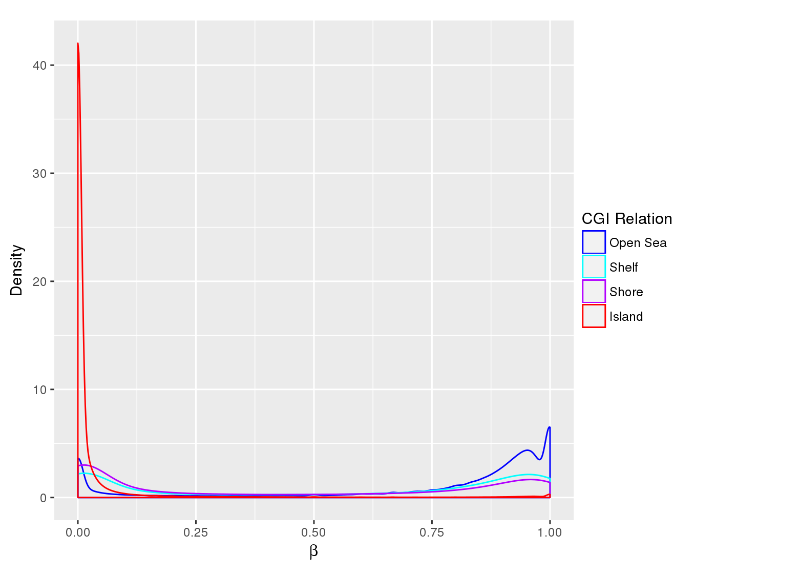
Methylation Value Densities of Sample Groups
The plots below compare the distributions of methylation values in different sample groups, as defined by the traits listed above.
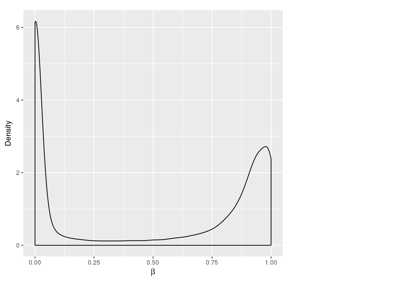
Methylation Value Densities of Site Categories
In a similar fashion, the plot below compares the distributions of beta values in different site types.
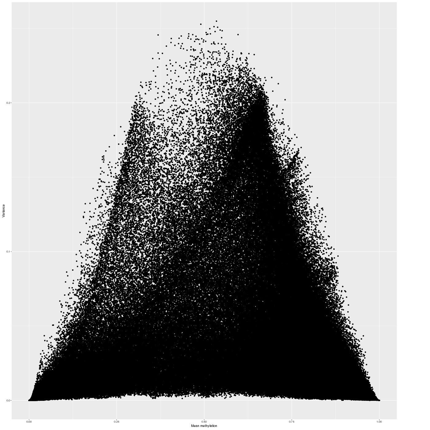
Inter-sample Variability
The variability of the methylation values is measured in two aspects: (1) intra-sample variance, that is, differences of methylation between genomic locations/regions within the same sample, and (2) inter-sample variance, i.e. variability in the methylation degree at a specific locus/region across a group of samples.
The following figure shows the relationship between average methylation and methylation variability of a site.
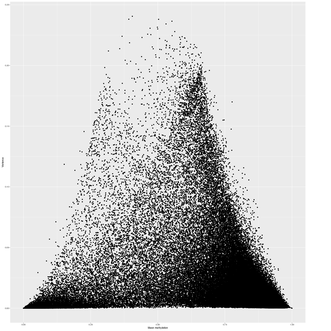
In a complete analogy to the plots above, the figure below shows the relationship between average methylation and methylation variability of a genomic region.
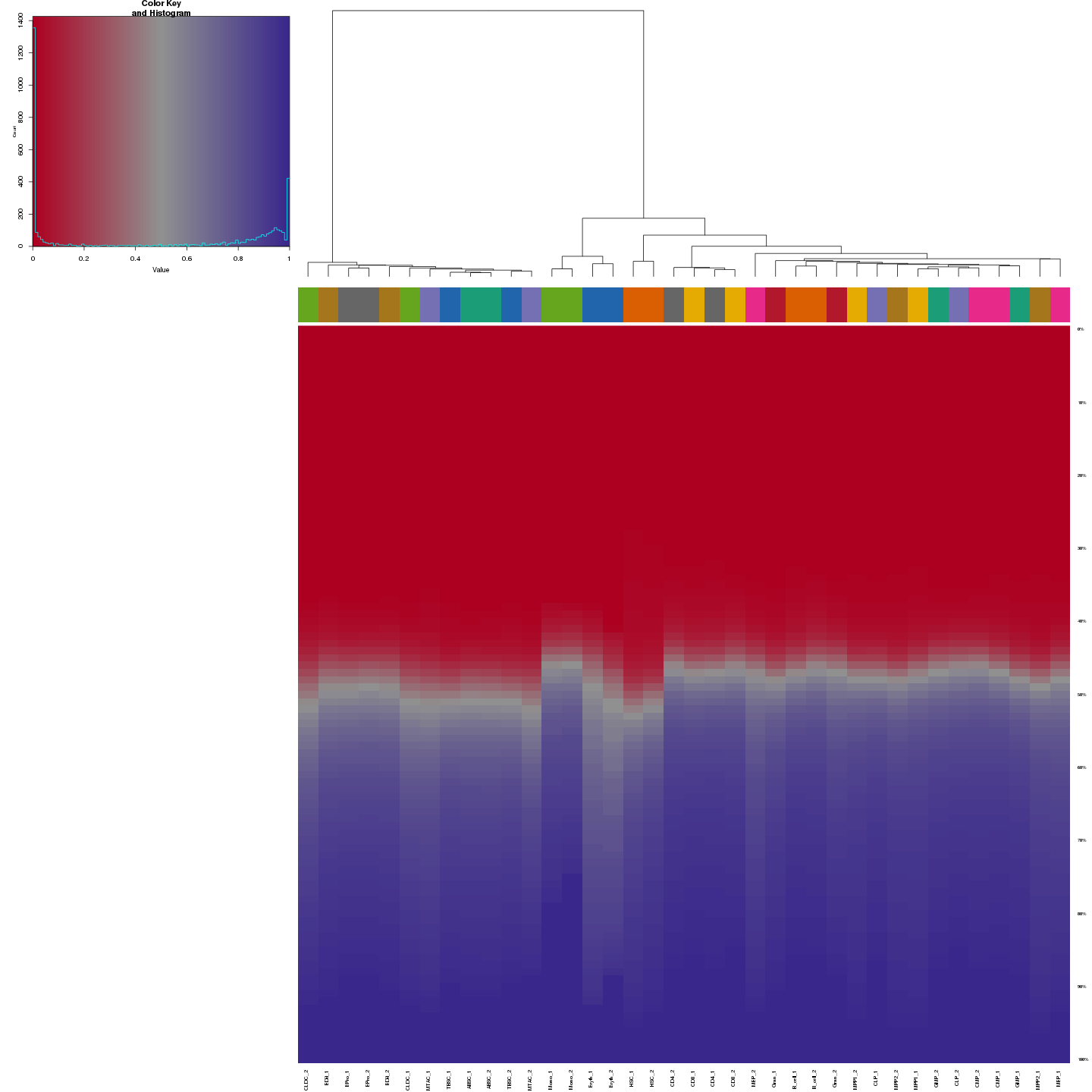
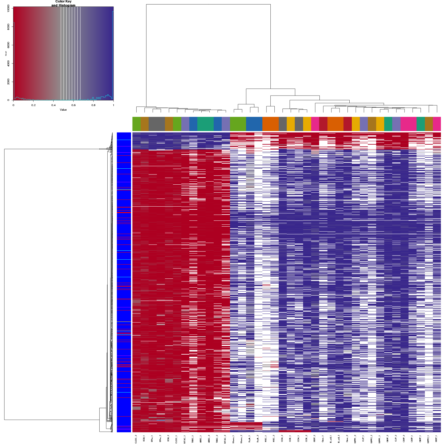
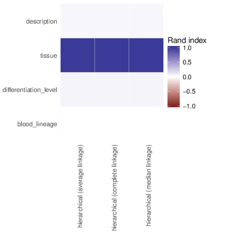
The figure below shows clustering of samples using several algorithms and distance metrics.
Identified Clusters
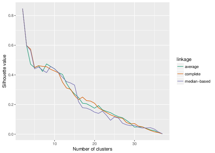
Using the average silhouette value as a measure of cluster assignment [1], it is possible to infer the number of clusters produced by each of the studied methods. The figure below shows the corresponding mean silhouette value for every observed separation into clusters.
The table below summarizes the number of clusters identified by the algorithms.
Clusters and Traits
The figure below shows associations between clusterings and the examined traits. Associations are quantified using the adjusted Rand index [2]. Rand indices near 1 indicate high agreement while values close to -1 indicate seperation. The full table of all computed indices is stored in the following comma separated files:
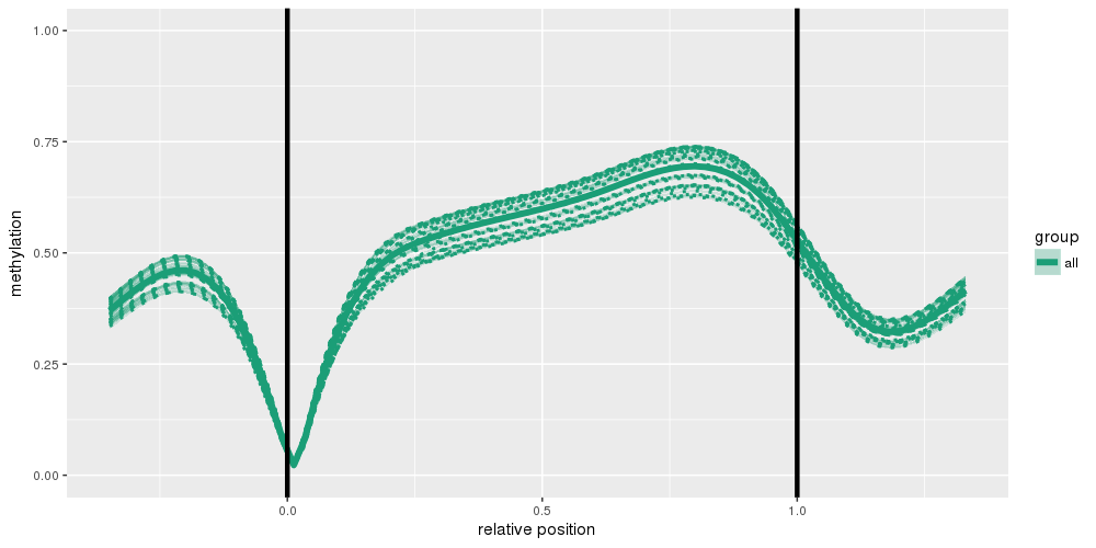
Methylation profiles were computed for the specified region types. Composite plots are shown