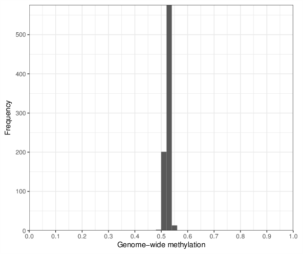
Genome-wide methylation levels were computed for all 792 samples. The figure below shows the distribution of these values.
Genome-wide methylation levels were computed for all 792 samples. The figure below shows the distribution of these values.
Plots for the visualization of predicted ages based on the DNA methylation pattern.
A predefined predictor was used and is available as a comma-separated file.
Plotting annotated ages versus predicted ages and indicating different traits with different colors and different shapes.
| Compare first trait | |
| Compare second trait |
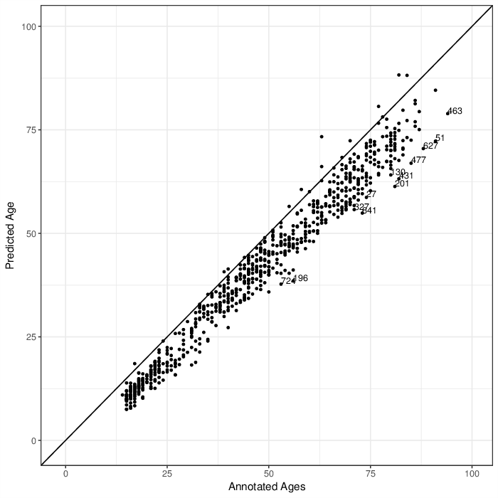
Comparing predicted ages by age predictor with annotated ages. Points that are labeled with their identifiers have a larger difference than 15 years between predicted and annotated age.
Plotting differences between predicted and annotated age for each sample.
| Sample representation |
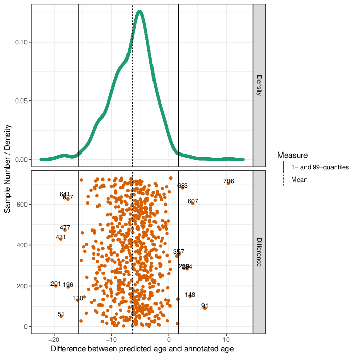
Upper Panel: Shown is the distribution of the differences between predicted ages and annotated ages. The black line indicates the median of these differences. \ Lower panel: Differences between predicted ages and annotated ages. The mean of the difference is shown as a dashed line, the 1- and 99-perecntile, respectively, as solid lines. Points that are labeled with their identifiers lay outside of the quantiles.
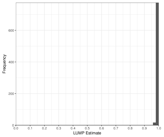
Immune cell content estimation was performed using the LUMP algorithm [1]. Estimates are values between 0 and 1 and are based on up to 44 sites per sample. The figure below shows the distribution of immune cell content values.
The dataset contained reference methylomes defined by the sample annotation column Cell Type. Detected reference methylomes were are summarized in the table below.
| Cell type | Number of samples |
| CD4+ T cells | 6 |
| CD8+ T cells | 6 |
| CD14+ monocytes | 6 |
| CD19+ B cells | 6 |
| CD56+ NK cells | 6 |
| granulocytes | 6 |
The contributions of cell types were estimated using the method by Houseman et al [2].
In the first step the reference methylomes were used to estimate the association of each CpG position to each of the cell types. The stength of association was measured using F-test. To decrease the computation load, only 100000 most variable CpGs were considered. Finally, only 500 CpGs with the lowest F-test p-value were used in the contribution estimation. The plot below visualizes the distribution of F statistic values for all tested CpGs. Note that selecting the most informative CpGs is equivalent to applying an F statistic cut-off of 1307.
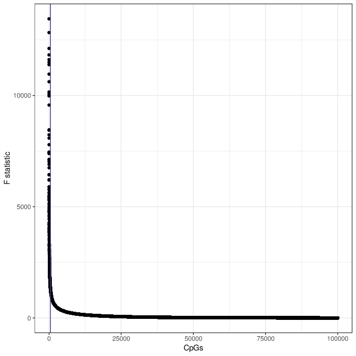
Scatter plot visualizing the F statistic of the cell type association model for each CpG position from the tested subset. The vertical blue line, if present, reflects the selection of 500 best markers for the projection.
After the marker selection, a projection of the target data onto the space of the marker selection model coefficients yields contributions of each reference cell type to each measured DNA methylation profile. The resulting cell type contributions are available in a dedicated comma-separated file accompanying this report. These values are also displayed in the heatmap below. The contributions are constrained to be greater or equal to zero, and the per-sample sums are expected to be close to one, i.e. they are estimates of the cell type proportions. Per-sample totals much larger than one may indicate the problems with the procedure, e.g. bad correspondence of the target data to the reference methylomes, significant batch effects etc.