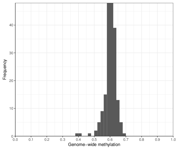
Genome-wide methylation levels were computed for all 188 samples. The figure below shows the distribution of these values.
Genome-wide methylation levels were computed for all 188 samples. The figure below shows the distribution of these values.
Plots for the visualization of predicted ages based on the DNA methylation pattern.
A predefined predictor was used and is available as a comma-separated file.
Plotting annotated ages versus predicted ages and indicating different traits with different colors and different shapes.
| Compare first trait | |
| Compare second trait |
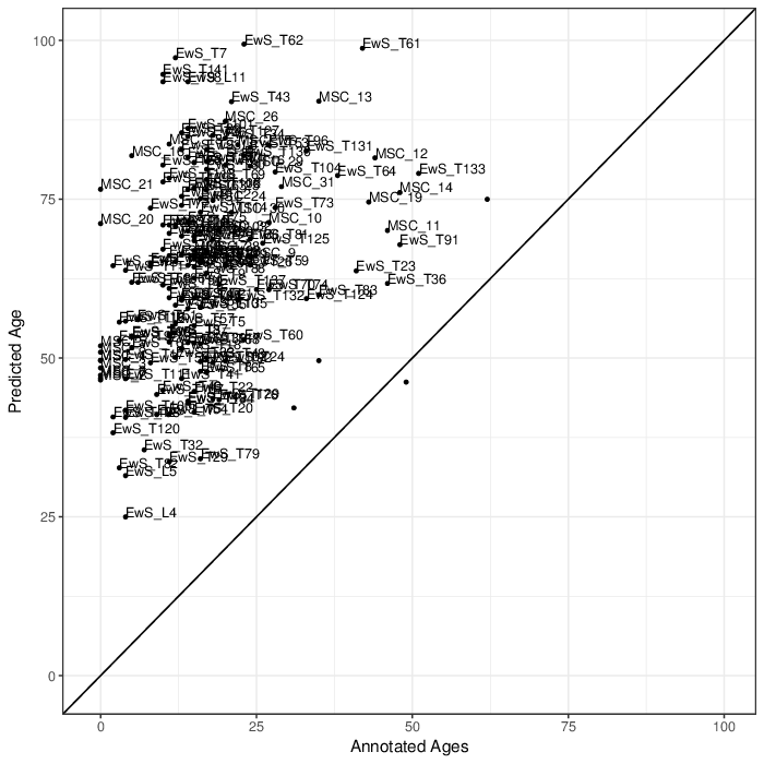
Comparing predicted ages by age predictor with annotated ages. Points that are labeled with their identifiers have a larger difference than 15 years between predicted and annotated age.
Plotting differences between predicted and annotated age for each sample.
| Sample representation |
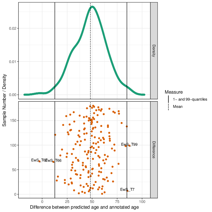
Upper Panel: Shown is the distribution of the differences between predicted ages and annotated ages. The black line indicates the median of these differences. \ Lower panel: Differences between predicted ages and annotated ages. The mean of the difference is shown as a dashed line, the 1- and 99-perecntile, respectively, as solid lines. Points that are labeled with their identifiers lay outside of the quantiles.
Immune cell content estimation was not performed because the assembly is not supported.